How did you attract/address your audience?

Front Cover
My masthead attracts my target audience as its very bright and distinctive. I decided to do this as it is significantly large, so therefore it needs to be enticing. I chose to layer two colours, black and yellow, I did a questionnaire to determine the font used and my target audience chose this, therefore appealing to them.

I decided to alter this photograph by changing the colour to black and white. I did this to draw the readers attention in more, as this is the first thing you see when you look at the magazine. Furthermore this links to Mulvey's theory of the male gaze. This definitely attracts the reader due to the fact that this is different to many other magazines, therefore giving it a unique style.
This puff attracts both males and females, as the colours are stereo-typical for these genders. In addition I did this because I wanted to target both genders as the magazine features male artists.
This address my target audience as the word 'exclusive' will entice them due to the fact that you will only find it in this magazine. I curved the words as this attracts my target audiences age, I did this as it looks more intriguing and outgoing.

As I did with the masthead I did here with the stars name for the same reason. This stands out significantly more which I aimed to do as this is the main headline. I chose to use pink for the text as this targets females and this is an article about a female. This is also used for diversion, therefore the consumer can escape their every day life.
I chose to add Indie bands on my front cover, this will appeal to my target audience because they will want to find new information about there favourite bands. I used orange and white as these colours are both different therefor contrasting with another.
This attracts my target audience due to the fact it is social media. I added the main social media websites to this page as a lot of my target audience will use them. This is the main feature which I used to appeal to my target audience as technology is so big. This also targets 'tribe wired' people as they have access to technology and/or social media.
This targets class (lower-middle) due to the price as it is significantly low. This attracts my target audience of university students and the working class because this price is affordable for them.

Contents Page
This attracts my target audience because the size is substantial, which is therefore noticeable.

I found that these photographs most definitely appealed to my target audience, because these gig photographs are of Indie bands. I made a questionnaire to see if these photographs attracted them and all the people I asked said they did, therefore showing that these images are ideal for my contents page. Furthermore this would intrigue fun/atics as they seek fun (gigs/concerts) like this therefore being intriguing.

All of this text will target my target audience as there are famous Indie bands located here. I added female artists in as well so this appeals to both males and females. This appeals to 'mainstreamers' as they consume ordinary text.

This engages with the reader as this is an overview of new releases of music as well as showing the best albums of 2016. I decided to do this as it's a little different but gives youths who are typically 'lazy' a quick insight into this page of the magazine.

Placing this on my contents page appeals to university students as they can get a deal on a magazine and yet not have to pay extortionate prices.
This floral design appeals to females as flowers are stereo-typically associated with women.By doing this I attracted a female audience to my magazine. I included these also, as this is aesthetically pleasing, therefore being entertaining.

Having this placed on my magazine will entice my target audience as they will want this magazine because it was voted the best. By doing this the consumer will satisfy their curiosity.

I decided that I would add green spots to the background of my contents page as this makes the magazine look busy, this therefore targets my target audience as they are young and bright. Furthermore this is aesthetically pleasing, therefore diverting the reader from there problems/day to day life.
Double Page Spread

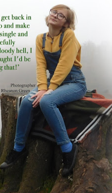
This photograph of my star attracts my target audience because she is of similar age, therefore showing them they are capable. The outfit she is wearing also appeals to them and she is dressed in affordable clothing that some people may like, therefore making her become an idol. The pose links to Mulvey's theory 'male gaze' as this pose is quite femine.


This font is aimed at my target audience as it's quite childish and quirky, therefore being appealing to them. I decided to draw petals around some of the lettering as this is different, but yet is very unique. In addition this is also aesthetically pleasing.

This targets my target audience as there is slang used, this is therefore the language many youths use. The words 'Bloody hell' are used as this intrigues my target audience. I chose green as this links with the stand first and also appeals to my target audience.
I found that this appeals to my target audience as many youths watch and even record videos on YouTube therefore aiming at them as well as aspirers.

A drop capital appeals to my target audience as the font is scribbled therefore looking quite childish.

This has been text wrapped as this makes the page look more quirky. I used the words 'I missed out' as a pull quote to intrigue the reader.

This appeals to aspiring photographers as they can see what other work that particular photographer has done.
In conclusion I think that I have targeted my target audience very well as I have taken into consideration colours, fonts, size and shapes.